Righto, I want to get deeper into vanilla React development (outside of the scope of SharePoint). This will enable me to utilise all of my React skills for future endeavours. I will be scaffolding a new React app using TypeScript because I put great value on Type safety when working within JavaScript - this is a preference I don’t want to shy away from due to my background as a C# dev.
Prep
Check the installed version of npm, update if necessary.
npm --v
Scaffold a new React app
# npx isn't a typo
npx create-react-app testApp --template typescript

# navigate to the app directory
cd testApp

# test the app
yarn start
The app is now running in your browser (or at least it should be).
Navigate to, and update the <a /> tag within the App.tsx file as follows:
import React from 'react';
import logo from './logo.svg';
import './App.css';

const App: React.FC = () => {
  return (
    <div className="App">
      <header className="App-header">
        <img src={logo} className="App-logo" alt="logo" />
        <p>
          Edit <code>src/App.tsx</code> and save to reload.
        </p>
        <a
          className="App-link"
          href="https://reactjs.org"
          target="_blank"
          rel="noopener noreferrer"
        >
          Woot, new React project w/ TypeScript!
        </a>
      </header>
    </div>
  );
}

export default App;
Save the App.tsx file; the app in your browser should automatically refresh the DOM showing the changes. You can go to the Dev Tools in Chrome by hitting F12 and monitor the components as they update - only the changed component will update - this is the core of React!
Stop the server from running.
[Ctrl + C]
y [Enter]
Install TSLint
We’re not done yet! Let’s improve our workflow a little by installing and configuring TSLint.
VSCode -> install Extension -> TSLint (deprecated)
The reason that we use the deprecated version is because it’s rated 5 stars, where the new version is rated only 3 stars (and buggy AF).
# add dev dependencies; TSLint, TSLint React, TypeScript TSLint Plugin
yarn add --dev tslint tslint-react typescript-tslint-plugin
Select the TypeScript version.
VSCode -> [F1] -> “Select TypeScript Version” -> Use Workspace Version
Add a TSLint config file
Navigate to the root of your app folder structure, add a new file ./tslint.json
You can use my example as a starting point.
{
    "defaultSeverity": "error",
    "extends": [
        "tslint:recommended"
    ],
    "jsRules": {},
    "rules": {
      "class-name": false,
      "export-name": false,
      "forin": false,
      "label-position": false,
      "member-access": true,
      "no-arg": false,
      "no-console": false,
      "no-construct": false,
      //"no-duplicate-case": true,
      "no-duplicate-variable": true,
      "no-eval": false,
      "no-internal-module": true,
      "no-shadowed-variable": true,
      "no-switch-case-fall-through": true,
      "no-unused-expression": true,
      "no-use-before-declare": true,
      "semicolon": true,
      "trailing-comma": false,
      "typedef": [true, "variable-declaration"],
      "typedef-whitespace": false,
      //"valid-typeof": true,
      "variable-name": false,
      "whitespace": false,
      "ordered-imports": false,
      "max-line-length": false,
      "no-string-literal": false,
      "object-literal-sort-keys": false,
      "object-literal-shorthand": false
    },
    "rulesDirectory": []
}
Work your way through the scaffolded *.ts and *.tsx files and resolve the rules issues you see. Here is an example:
Here you’ll see the default App.tsx component, which uses single quotation marks for import strings (among others).
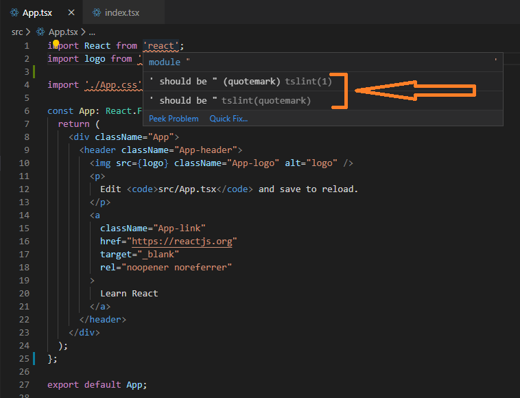
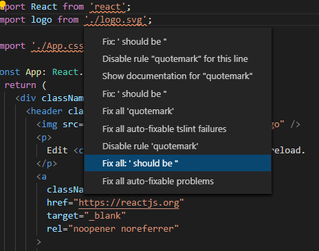
Pressing [Ctrl + .] (period) will provide the following options; note that you can select to only fix a single instance, or even disable linting for the very next line. We would fix all per the screenshot in this instance.
You’re now ready to continue.
Adding more functionality
Right, we’ve got a basic app scaffolded. Now it’s time to add some more functionality.
I’m going to scaffold a new component that will be used as a basis for future blog posts on the subject. We’re adding properties and state functionality that doesn’t do a hell of a lot now, but will be used in future.
Properties are used to configure a component at the time it’s run; I typically use this for configuration of the component.
State is used where a component will change at some point and that change must be re-rendered in the UI; I typically use State where dynamic data is a concern.
add a new Component
Add a new folder structure to the project; ./src/Components/TestElement
Within that new folder, add the following files:
./src/Components/TestElement/TestElement.tsx./src/Components/TestElement/TestElement.css./src/Components/TestElement/ITestElementProps.ts./src/Components/TestElement/ITestElementState.ts
Now update those files as follows:
// ./src/Components/TestElement/TestElement.tsx

import React, { ReactNode } from "react";
import { ITestElementState } from "./ITestElementState";
import { ITestElementProps } from "./ITestElementProps";
import "./TestElement.css";

export default class TestElement extends React.Component<ITestElementProps, ITestElementState> {
    /**
     *
     */
    constructor(props: ITestElementProps, state: ITestElementState) {
        super(props);

        this.state = {
            numberOfItemsRendered: -1
        };
    }

    public render(): ReactNode {
        return (
            <span className="TestElement-Heading">{this.props.message}: {this.state.numberOfItemsRendered}</span>
        );
    }
}
 /* ./src/Components/TestElement/TestElement.css */

.TestElement-Heading {
    font-size: xx-large;
    color: red;
}
// ./src/Components/TestElement/ITestElementProps.ts

export interface ITestElementProps {
    message: string;
}
// ./src/Components/TestElement/ITestElementState.ts

export interface ITestElementState {
    numberOfItemsRendered: number;
}
Add the new Component to the App
Right, we’ve now got a new component. How do we get that to be visible within our React app?
We’re going to return to App.tsx and make the following update.
const App: React.FC = () => {
  // instantiate new object; TestElement
  var myTestElement = <TestElement message="This is a TestElement object" />;
  return (
    <div className="App">
      <header className="App-header">
        <img src={logo} className="App-logo" alt="logo" />
        <p>
          Edit <code>src/App.tsx</code> and save to reload.
        </p>
        <a
          className="App-link"
          href="https://reactjs.org"
          target="_blank"
          rel="noopener noreferrer"
        >
          Woot, new React project w/ TypeScript!
        </a>
        {myTestElement}
      </header>
    </div>
  );
};
Run the app again:
yarn start
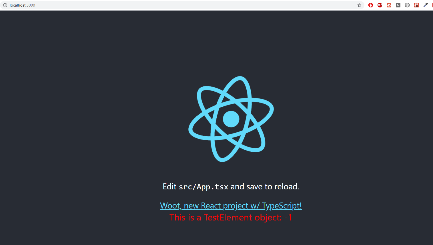
You should see something similar to the following (red text being the very boring component we just added).
Finishing up
We’re done here, the App is ready for us to add functionality and flesh it out - as mentioned previously, I plan to use this app to highlight other functionality.
if (imageAbove === "same as what you're seeing") {
  return "Job's a goodun!";
}
else {
  return "leave me a comment here and I'll help you out!";
}